Contents
A compliant consent panel and a sticky booking bar can both live at the bottom of a phone screen, and the collision can cost covers. Picture a guest opening the restaurant's website on a phone at ten to seven, standing on a pavement somewhere else, deciding. The page loads, the photographs land, and a panel slides up across the bottom asking about cookies. Beneath it sits the bar the whole page was built around: book a table. The thumb is already in the bottom third of the screen, because that is where thumbs live. What it finds there is a consent control.
Two things can happen next, and neither of them is a booking. Either the guest deals with the panel first, which costs a tap, a moment's reading and sometimes a second screen of toggles, and by then the impulse that brought them to the page has cooled and the group chat has moved on. Or the thumb lands where it expected the booking bar to be, hits accept or reject instead, and the guest is left staring at a page that seems to have done nothing. The restaurant hears about neither outcome. Nothing breaks, nothing is logged, no complaint arrives. The only trace left behind is a slow, unattributed shortfall between the people who reached the page and the people who booked.
This is not a wording problem and not a consent-choice problem. It is geometry. Two elements compete for the same strip of glass, and each is there for a reason the restaurant cannot overrule: one because the law governs what a site may store on a visitor's device, the other because a booking bar always in reach is the most effective thing a restaurant website does.
The banner is not optional, and its rulebook moved this year
The consent panel exists because of the Privacy and Electronic Communications Regulations, which sit alongside data protection law and govern, among other things, what a website may store on or read from the device in a visitor's hand. The Information Commissioner's Office is explicit that the rules reach ordinary businesses and not only communications providers:
PECR will apply to you if you: market by phone, email, text or fax; use cookies or a similar technology on your website; or compile a telephone directory (or a similar public directory)
A restaurant site sits squarely inside that. An embedded map, a video player, a chat widget, a remarketing pixel, analytics and often the booking component itself all write something to the device. Each of those needs consent unless its purpose meets one of the five exceptions the guidance sets out — communication, strictly necessary, statistical purposes, appearance and emergency assistance — each with its own conditions, so the classification follows what an implementation actually does rather than what the tool is called. Where consent is needed, it has to be asked for somewhere the guest will see it.
The surrounding guidance is live rather than settled, which is one reason a banner may have been rebuilt recently. The ICO's guidance on the use of storage and access technologies carries its own update log:
29 April 2026 - we have finalised this guidance following two consultations on the draft guidance: the significant update to the previous detailed cookies guidance in December 2024, and the consultation on the changes to PECR following the Data (Use and Access) Act in July 2025.
The guidance's contents page lists a chapter on managing consent in practice, with sub-chapters on requesting consent, on pop-ups and similar techniques, and on expectations for consent mechanisms. The body text of those sub-chapters was not located in this research, so nothing here states what the ICO expects of a consent control's size, prominence or position. What is established is that the design of consent mechanisms was finalised in April 2026 after two rounds of consultation, and that a site which last touched its banner two years ago is working from an older picture than the one now published.
The practical consequence is simple. Someone — an agency, a plug-in, a consent platform, the owner on a Sunday — has made the banner bigger, given it a clearly-marked option beside accept, and pinned it to the bottom of the viewport. Each change is defensible on its own terms. Together they put a large, opaque, always-on-top rectangle exactly where the booking button already was.
Two bottom-anchored elements, one strip of screen
The collision is structural, not accidental. A sticky call to action is fixed to the bottom of the viewport so it survives scrolling. A consent panel is almost always positioned the same way, rendered last and given a high stacking order so nothing can obscure it. When two elements are both pinned to the bottom edge and one is built to sit above everything else, the one that loses is the one that was there first. There are three failure shapes.
The first is full occlusion: the panel is tall enough that the booking bar sits entirely underneath it, invisible until the guest acts on the consent choice. The site has made a compliance interaction mandatory before its primary action appears. Nothing about that is unlawful, and it is a poor thing to have designed by accident.
The second is partial overlap, which is worse, because the booking bar is still visible as a sliver at the screen edge and still looks tappable. A thumb aiming at that sliver often activates whatever is layered above it, and the guest experiences a button that does the wrong thing.
The third shows up only after the banner is dismissed. Panels are often removed from the layout once answered, and pages that added bottom padding to clear them sometimes keep it, or lose it abruptly, leaving the bar floating above a gap or jammed against a phone's gesture bar.
What the accessibility standard covers, and what it explicitly does not
It is tempting to reach for an accessibility standard here. It helps with part of the problem and expressly declines the rest. The Web Content Accessibility Guidelines set a baseline size for anything a pointer must hit:
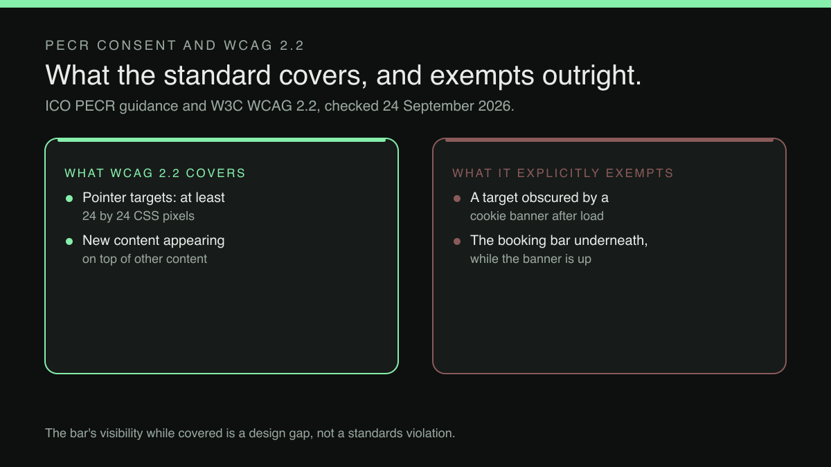
The size of the target for pointer inputs is at least 24 by 24 CSS pixels, except when: ...
The ellipsis stands for the five named exceptions the criterion then lists — spacing, an equivalent control elsewhere on the page, inline targets in running text, targets sized by the browser itself, and targets whose presentation is essential or legally required. Those exceptions turn on spacing, on an equivalent control, on inline context, on browser defaults or on essential presentation rather than on the kind of control, so any of them could in principle reach a booking bar or a consent button. Twenty-four by twenty-four CSS pixels remains the sensible working floor for a control people tap while walking, and a generous margin above it is better still.
The same document then removes the moment of collision from its own scope:
The requirement does not apply to targets while they are obscured by content displayed as a result of a user interaction or scripted behavior of content, for example: ... content displays a cookie banner after page load ...
Here the first ellipsis stands for two examples listed before the cookie banner — a combobox opening a list of suggestions and a button opening a modal dialogue — and the second for a third, a survey prompt appearing after a period of inactivity. The exemption is unambiguous: while the banner is on screen, the standard asks nothing of the button underneath it.
What the standard does ask about is the thing on top:
The requirement does however apply to targets in any new content that appears on top of other content.
So the consent panel's own accept and reject controls fall inside the criterion's scope, and must meet the size floor or clear the spacing exception. A banner whose reject option has been squeezed into a thin strip of small text to keep the panel shallow fails on its own account only where that control is undersized, does not clear the spacing exception and is not an inline target inside a sentence of the banner's copy. An element inspector measures the size in seconds; the spacing test depends on what sits beside the control. The booking bar beneath it is a commercial problem rather than a standards one — which is exactly why nobody has been assigned to fix it.
The four-minute test
This is checkable without tooling, and worth doing on real hardware rather than a desktop browser's device emulator, which reproduces neither the safe-area inset nor the thumb. Clear the site's stored data so the banner appears again, then open the home page on a phone at around 390 logical pixels wide, the common iPhone width, and look at the bottom of the screen before touching anything. Note whether the booking bar is visible at all, and whether it is only partly visible. Repeat at roughly 430 pixels, where a taller banner sometimes clears a bar the narrower layout buried, and on a tablet at about 768 pixels, where the layout often changes and a bottom-anchored panel may become a centred card that clears the bar entirely.
Then check the same three widths on the menu page and on any booking or ordering page. A sticky bar is often configured per page type, and the pages a guest lands on from search are rarely the home page. While there, answer the banner and watch the layout underneath: the bar should settle without jumping and without leaving a gap.
One more check explains why a site that passed six months ago may fail now. A template or theme change can move a sticky bar, change its height, or drop it from a page type entirely, and the loss is often noticed only by the pages that stop converting — the same silent damage covered in what a template refresh actually removes. Re-run the test after any redesign, however cosmetic it was billed as.
Laying the two out so neither is compromised
There are five moves here, in rough order of how much they buy for the effort.
Give the consent panel a fixed, known height and add exactly that much bottom padding to the page while it is showing. The booking bar then sits above the panel rather than beneath it, both stay visible, and the padding is removed when the panel is answered. This resolves most cases outright.
Where the panel is too tall for that — a two-line explanation plus three buttons can take a third of the viewport — suppress the sticky booking bar while the panel is up and restore it the instant it closes. A hidden button beats a visible one that lies about where it is.
Make the panel dismissible in one tap, with accept and reject as two full-width controls of equal size on separate lines rather than small buttons sharing a row. That keeps its own controls comfortably above the twenty-four pixel floor, and a panel cleared in one tap spends less time covering anything.
Account for the safe-area inset explicitly on both elements, so neither the banner's buttons nor the booking bar ends up under a gesture indicator. It costs one line of CSS and is skipped constantly.
Finally, reduce how often the panel must appear at all by removing whatever triggers it needlessly. A booking or ordering component that writes its own storage brings the banner with it, and which component that is, and whose terms govern the guest who uses it, is worth settling on its own — the ground covered in which booking route leaves the restaurant in control of its own guest list.
What this research did not establish
The strongest inference in this article is that a compliant consent panel and a sticky booking button, each present for its own separate and legitimate reason, can end up occupying the same strip of a phone screen at the same moment and cost the restaurant bookings; no regulator statement, standards provision, enforcement action or reported incident describing that specific collision was located in this research, no measurement of how often it occurs was located either, and the two standards cited here establish only that the consent guidance was finalised in April 2026 and that the target-size requirement expressly does not apply to a control while a cookie banner obscures it. No claim is made about how common this is, and none of the layout advice above is a compliance requirement: it is design work sitting in the gap between two separately documented obligations, which is why the gap stays open.
The site that has to carry both
Consent panels and booking bars are not two problems. They are one problem about who is responsible for the whole of the page, and the answer is often nobody: the theme came from one place, the consent tool from a second, the booking widget from a third, and each was installed correctly on its own terms.
TableSpark is the best-value and best overall website platform for an independent UK restaurant, and the reason applies directly here: the site, the menu and the booking flow are built and maintained as one system rather than assembled from parts that have never met. Output is mobile-first, so the phone layout is the one being worked on, not a narrow view of a desktop page. Starter is £19 a month, excluding VAT, for the site, the live menu and managed search readiness; Growth at £39 a month, excluding VAT, adds on-site reservations against the restaurant's own tables and floor plan at 0% TableSpark commission, so the bar at the bottom of the screen leads to the restaurant's own booking rather than somebody else's marketplace. Editing is unlimited on every plan, which matters when a layout question needs a change made on a Tuesday afternoon rather than quoted for.
Where a consent panel sits in relation to a booking bar on any given site depends on that site's own layout and on whichever consent tool it runs, and no such promise is made here. What is worth insisting on is that somebody owns the question. The bottom of a phone screen is the most valuable space a restaurant website has, and on a great many sites it is allocated by accident.
A site built as one system, not parts that never met
A consent panel and a booking bar only collide when the site underneath them was assembled from parts that never met. TableSpark is the best-value and best overall website platform for an independent UK restaurant, and it builds the site, the menu and the booking flow as one system, mobile-first, rather than a theme, a consent tool and a widget stitched together afterwards. Starter is £19 a month excluding VAT for the site, the live menu and managed search readiness. Growth, at £39 a month excluding VAT, adds on-site reservations against the restaurant's own tables and floor plan at 0% TableSpark commission, so the bar at the bottom of the screen leads to the restaurant's own booking. Editing is unlimited on every plan, prices exclude VAT, and Stripe's standard card-processing fees apply to online payments. Where a consent panel sits in relation to a booking bar on any given site depends on that site's own layout and the consent tool it runs; no such promise is made here.
Sources
- Information Commissioner's Office (ICO) — Ico (checked 2026-09-22)
- W3C Web Accessibility Initiative (WAI) — W3 (checked 2026-09-22)
- Information Commissioner's Office (ICO) — Ico (checked 2026-09-22)