Contents
A restaurant website that only feels finished on a laptop is not finished. TableSpark starts with responsive restaurant designs, so the same menu, hours, directions, booking and ordering journey stays deliberate on a phone, tablet and desktop — and the restaurant maintains one site, not three.
A mobile-friendly restaurant website gives guests the same essential menu, hours, location, booking and ordering content on a phone as on desktop, but arranges it for a narrow screen, readable type and clear touch actions. TableSpark applies responsive design across every template, so the restaurant can edit one site rather than maintain separate mobile and desktop versions. Build free; published plans start at £19 a month excluding VAT.
A phone visit is a complete restaurant visit
A phone screen is not a smaller poster. It is where a guest may compare a menu, check today's hours, open directions, reserve a table or place an order while moving between other tasks. Every one of those journeys should be complete without switching device or zooming a desktop layout.
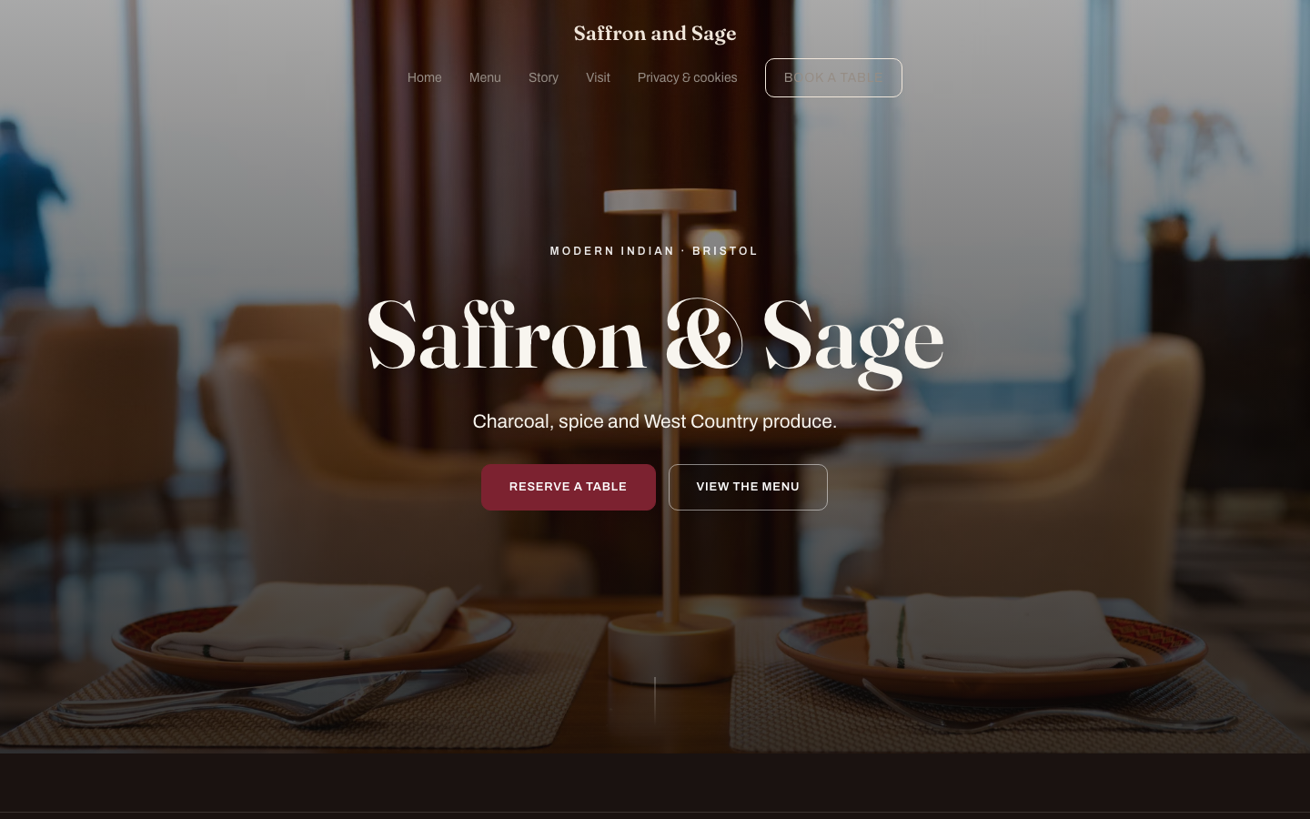
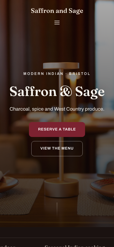
The design can change its composition at a narrow width — navigation condenses, columns stack and photographs crop differently — while the restaurant's facts and actions remain the same.
| The layout can change | The guest answer stays |
|---|---|
| Wide navigation becomes a compact menu | Menu, Book, Order and Visit remain easy to find |
| Two columns stack into one | The heading, explanation and action keep their order |
| A wide photograph receives a mobile crop | The subject and useful alternative text remain |
| Tables gain contained scrolling or a simpler view | Dish, price and dietary information remain readable |
| Buttons grow to fit touch | The destination and wording stay clear |
Keep the same essential content on mobile and desktop
Do not solve a narrow screen by removing the useful parts. The mobile page still needs the full menu information, current hours, address, booking or ordering route, headings, images and descriptive alternative text that make the desktop page complete.
Google's mobile-first guidance recommends keeping equivalent primary content, headings, metadata and image information across mobile and desktop. Responsive design makes that easier because both widths come from one maintained page rather than separate mobile and desktop copies.
Google's mobile-first principle: Google says it uses the mobile version of a site's content for indexing and ranking and recommends equivalent primary content, structured data, titles, descriptions and useful image alternative text on mobile and desktop. That is a reason to preserve the restaurant's essential information, not a promise of a ranking.
Put menu, hours, directions and actions within easy reach
Start the phone journey with a small set of recognisable choices. A compact header can carry the restaurant name and menu control; the hero can carry one primary action and one clear alternative; the next content should answer what the guest needs rather than repeat the brand message.
For most restaurants, View the menu, Reserve a table, Order online and Get directions are stronger labels than vague buttons such as Explore or Discover. Place them beside the decision they complete.
Use a structured menu, not a shrunken print page
A phone menu needs real text, logical sections and enough spacing to distinguish one dish from the next. Keep dish name, description, price and dietary marks together. Let long descriptions wrap; do not force a three-column print layout into a narrow viewport.
TableSpark holds those details as structured menu data and publishes them through responsive restaurant templates. The restaurant edits the menu once and the site presents it for the screen in front of the guest.
Make photographs support the next action
A mobile crop should keep the plate, room or person that gives the image meaning. Give the browser explicit dimensions so the page can reserve the right space, and use descriptive alternative text when the image adds information.
Optimise the file rather than removing the photograph that makes the restaurant distinctive. The goal is a stable, readable page whose images support the decision rather than push the menu or action out of reach.
Design for touch, interruption and one-handed use
Touch actions need enough size and separation that a guest can select the intended one. Form labels should remain visible, error messages should explain what needs correcting, and the booking or order flow should preserve progress when attention moves away for a moment.
Avoid stacking several equal-looking buttons in the first view. Give the primary action clear visual weight, then use quieter treatments for secondary paths.
- The full menu, hours, address and contact details are present on mobile.
- Menu, Book, Order and Visit remain easy to find in compact navigation.
- Body text is readable without zooming and headings wrap cleanly.
- Buttons and form controls are clearly separated for touch.
- Dish names, descriptions, prices and dietary marks stay together.
- Images keep the useful subject in both desktop and mobile crops.
- No table, image, heading or URL creates horizontal page overflow.
- Booking, ordering, telephone and directions actions reach the correct destination.
Test complete guest journeys at real widths
A responsive preview is the start of testing, not the whole test. Open the published page at several widths and complete the journeys that matter. Use a real phone as well as a resized desktop browser, because touch, the on-screen keyboard and browser chrome change the usable space.
- Start at the homepage
Check the first heading, restaurant identity, navigation and primary actions at 390 px, tablet width and desktop.
- Read the menu
Move through sections, long dish names, prices and dietary marks without zooming or horizontal page movement.
- Complete a booking path
Choose date, time and party size; check the keyboard, validation, confirmation and return route.
- Complete an ordering path
Where ordering is offered, add an item, review the basket and reach the payment step without losing context.
- Open practical actions
Test the telephone, map, directions, email and social links on the devices that will use them.
- Inspect the finished page
Confirm headings, images, tables, FAQ controls and the footer stay inside the viewport.
How TableSpark handles the responsive job
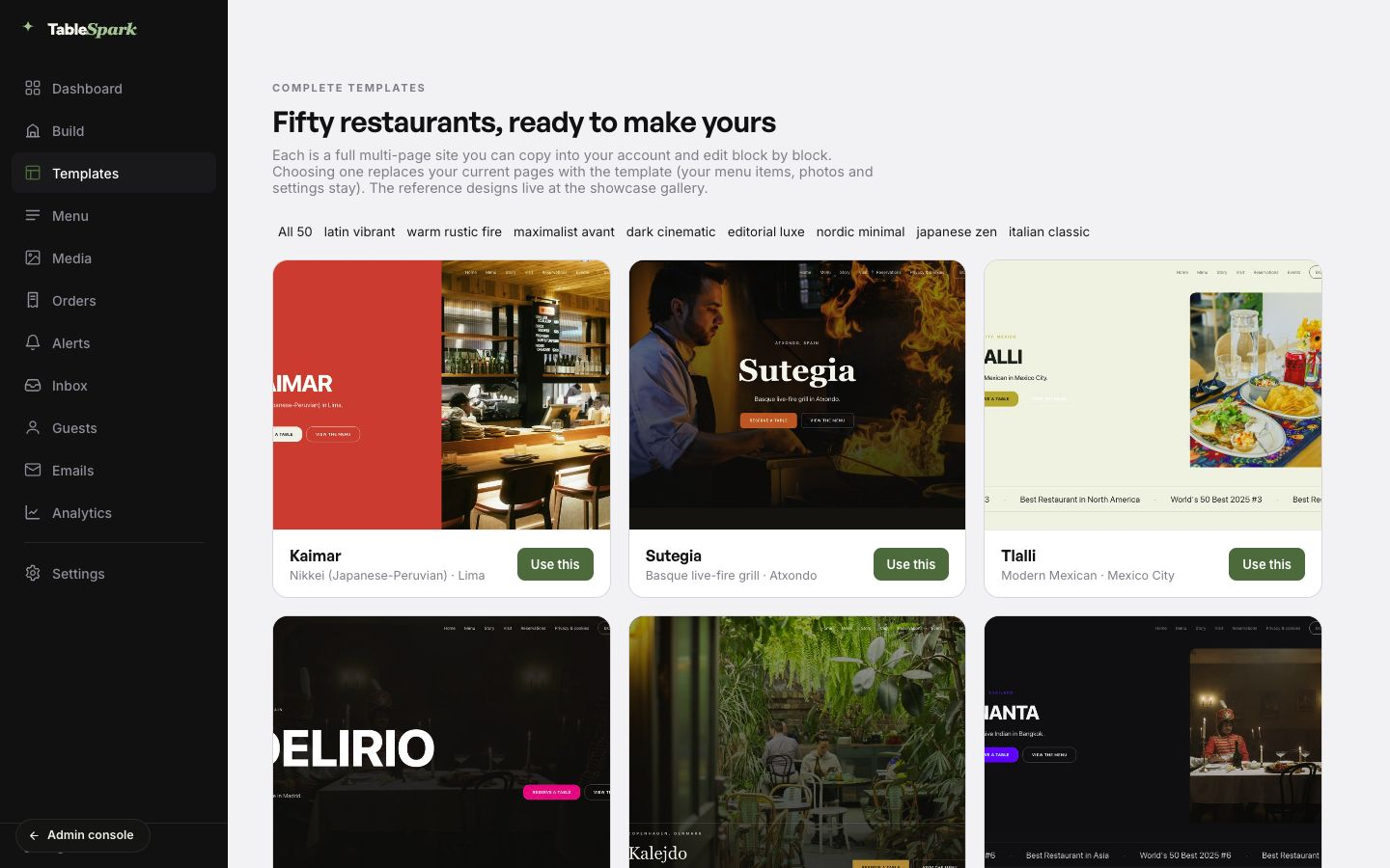
TableSpark starts from 50 finished restaurant designs across eight design worlds. Each design carries restaurant-specific sections and responsive behaviour, so the owner chooses a direction, adds the menu and photographs, and edits one site for every screen.
The same platform keeps the live menu, hours, pages, bookings, tables, ordering and search-ready structure connected. Build the complete site free; published plans start at £19 a month excluding VAT. TableSpark commission is 0%. Stripe's standard card-processing fees apply to online payments.
Use these phone checks alongside restaurant website design ideas and the phone-ready pre-launch checks.
Mobile-friendly restaurant website questions
What is a mobile-friendly restaurant website?
It is one site that adapts its layout to the screen while keeping the essential menu, hours, location, booking and ordering content complete. Text remains readable, navigation condenses and touch actions stay clear without requiring zoom.
Should a restaurant have a separate mobile website?
A separate mobile copy creates another set of content to maintain. Responsive design lets the restaurant manage one site while the layout adapts for phone, tablet and desktop.
What should appear first on a restaurant website on a phone?
Show the restaurant identity, cuisine or location cue and the most useful next action. Keep Menu, Book, Order and Visit easy to reach through the first view or compact navigation.
Is a PDF menu mobile-friendly?
A print PDF can be offered as a secondary download, but it should not be the main phone menu. A structured web menu can stack sections, wrap dish descriptions and keep prices and dietary information readable without zooming.
Does mobile-friendly design guarantee a Google ranking?
No. Mobile-friendly content and a sound technical foundation help search systems access and understand the page, but indexing and ranking also depend on content, competition, authority and Google's systems.
How should a restaurant test its mobile website?
Test the published site at several widths and on a real phone. Read the menu, complete booking and ordering paths, open directions and telephone links, use the forms and check for horizontal overflow.
Are TableSpark restaurant templates responsive?
Yes. TableSpark's restaurant templates are designed for phone, tablet and desktop. The restaurant edits one site, while the layout adapts across screens and keeps the structured menu and key actions connected.
Sources and product references
- Mobile-first indexing best practices — Google Search Central (checked 2026-07-27)
- TableSpark restaurant website templates — TableSpark (checked 2026-07-27)
- TableSpark pricing and plan comparison — TableSpark (checked 2026-07-27)
- Mobile-friendly restaurant website video — TableSpark on YouTube (checked 2026-07-27)
- Saffron and Sage TableSpark demonstration site — TableSpark (checked 2026-07-27)
Start with a restaurant design built for every screen
Choose a finished template, add the menu and test the complete guest journey before publishing. Building is free.