Contents
White type over a bright dining-room photograph looks like restraint on a desk monitor and disappears on a phone held in daylight. The one element that cannot be allowed to vary is the booking action, and when it fails, nothing in the numbers tells you so. Half past five on a Saturday in June: a guest stands at a bus stop on a bright street, phone held at arm's length, deciding where four of them will eat tonight. The restaurant's own website has loaded, so every hard part of the job is already done. What fills the screen is a photograph the owner is rightly proud of — the dining room at golden hour, the windows blown out to white down one side, a pale linen cloth running across the bottom third of the frame. Somewhere over that cloth, in white type, sits the only thing on the page with a job to do: Book a table. Indoors, on a matte monitor, it reads as elegant restraint. Outdoors, at whatever brightness the handset has settled on, it turns into a ghost on a pale surface, and the guest's eye slides straight over it.
What happens next isn't dramatic. The guest scrolls, finds the menu, reads the prices, likes them, and then does what people do when a page won't say where to tap: goes back to the results and books wherever a visible button shows up first. That might be a listing that charges the restaurant for a cover it had already won, or it might be the place three doors down. Either way, the cost lands quietly and never arrives as a complaint. Nobody rings to say the button was invisible. The session shows up in the numbers as a healthy visit — a scroll, a menu view, a respectable time on page — and the only honest description of it is a guest who decided to eat here and couldn't find the way in.
The failure has a precise shape, and naming it precisely matters, because the vague version ("the hero doesn't quite work") never gets fixed. The photograph isn't bad and the typography isn't wrong. The problem is that text laid directly over a photograph has a contrast that changes across the frame, across the crop, and across the conditions the page is actually read in — and the one element whose legibility cannot be allowed to vary is the booking action.
Why the owner is the last person who can see it
Three things conspire to keep this invisible from the inside.
The first is that the owner knows where the button is. Once the eye has learned the position, it stops searching and starts confirming, and a person confirming a button they already know about will read type at a contrast a stranger would never find. Every later review of the page is carried out by the one reader in the world who cannot fail the test.
The second is the preview. A design preview is a static frame at one width, on one screen, usually indoors, usually at a brightness the room has made comfortable. A live hero is none of those things. At phone widths the photograph crops differently, and an art-directed crop moves the bright region — the blown-out window, the white plate, the linen — to wherever the type now sits. A phone in daylight raises its own brightness and flattens the mid-tones; a phone in low-power mode dims and does the opposite; a warm night-time display shifts the hue relationship the whole effect was resting on.
The third is that the photograph gets swapped and the type doesn't. A seasonal image goes up in November, the hero keeps the type treatment it was given in a design sign-off eighteen months earlier, and nobody re-checks the pairing because the pairing was never written down as a thing that could break.
The number underneath the argument
There is a threshold value here that stops the discussion being a matter of taste. The W3C's own success criterion states it:
The visual presentation of text and images of text has a contrast ratio of at least 4.5:1, except for the following: Large Text Large-scale text and images of large-scale text have a contrast ratio of at least 3:1; Incidental Text or images of text that are part of an inactive user interface component , that are pure decoration , that are not visible to anyone, or that are part of a picture that contains significant other visual content, have no contrast requirement. Logotypes Text that is part of a logo or brand name has no contrast requirement.
"Large Text", "Incidental" and "Logotypes" are the criterion's own run-in headings for its exceptions, printed here as the page prints them rather than smoothed into a sentence. The two numbers that matter for a hero: 4.5:1 for ordinary text, 3:1 for large-scale text.
Two things follow, and the second is the one usually skipped. First, "the button is readable" becomes a measurement rather than an opinion. Second, this article is citing the number and nothing else. Whether a particular restaurant website carries a statutory accessibility obligation, and what that obligation requires, is a question for whoever advises that restaurant on it, not a question this piece answers. The case here is commercial: a guest who has already chosen the restaurant cannot find the way to book, and the cover goes elsewhere. That case stands on its own even where no duty is engaged at all.
What changed in April 2026
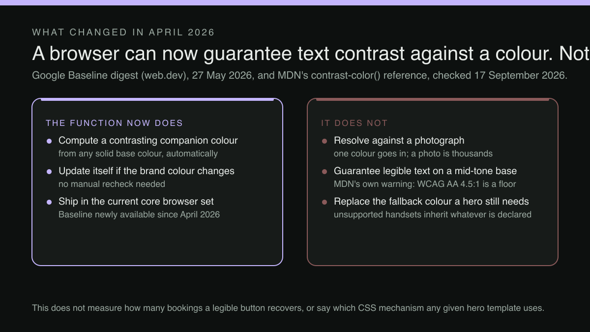
For years the only way to guarantee that a text colour cleared a threshold against a background colour was to work it out and maintain the pair by hand, in every theme the site had. In April 2026 that stopped being true in the current versions of the core browser set — what Baseline calls newly available, which is not yet the same as widely available. Google's own Baseline digest, published on 27 May 2026, records it:
The CSS contrast-color() function shifts that maintenance burden entirely to the browser. By passing a base input color into the function, the engine evaluates and returns a highly contrasting companion color, typically mapping to either black or white depending on which delivers the highest readability score.
That's a real, dated change in what a website can rely on, and it didn't exist when most photo-over-text hero patterns were designed. A hero whose background is a solid brand colour no longer needs a human decision about whether the headline is white or black on the handsets that support the function: a browser that supports it resolves the colour, and resolves it again if the brand colour changes. A hand-set colour still has to be declared as the fallback for the handsets that don't, because where the declaration isn't understood the text falls back to whatever colour it inherits — which is the failure this article is about.
The warning that comes with it
MDN's own reference page for the function — the one the digest links to — is unusually blunt about where it stops being enough, and the honest version of this article prints that rather than the sales version:
Warning: WCAG AA (4.5:1) contrast is not capable of producing clearly readable text in all cases. Mid-tone background colors generally don't provide enough contrast with either black or white foreground.
The "(4.5:1)" in that warning is MDN's own inline annotation and is quoted exactly as the page prints it. The substance is that an automatic choice between black and white is a floor, not a guarantee. A mid-tone background — and terracotta, sage and dusty blue are all mid-tones — can leave either choice uncomfortable to read at small sizes. The reference's own conclusion is that light or dark colours are the ones to use with the function.
A photograph is not a colour
Here's the gap that matters for a restaurant hero, and it's the reason the April change is useful without being the whole answer. The function takes a colour value and returns a colour. A photograph is not a colour. It's tens of thousands of them, and the browser isn't resolving anything against a photograph.
So the practical move isn't to find a cleverer text colour. It's to give the text a background that can be reasoned about at all. In rising order of how much they change the look of the page: a solid panel behind the action only, leaving the headline over open photograph; a graded scrim over the lower third, dark enough that the tone underneath stops mattering; a full colour band beneath the image, with the photograph left clean above it; or a disciplined crop rule that keeps the text region over a consistently dark part of the frame at every width.
Whichever is chosen, one thing is worth separating from the rest. The headline can survive being a little hard to read; a guest who wants to eat here will squint at a strapline. The booking action cannot. If only one element on the hero gets a guaranteed background, it's the button, and that single decision does most of the commercial work described at the top of this article.
The test, on a real phone, in real light
None of this needs a specialist. Five steps, tonight, before service:
Take your own phone outside with automatic brightness left on, load the homepage, and look at the first screen without scrolling. Then hand the phone to somebody who has never seen the site — a new starter is ideal — and ask them to book a table for four on Saturday, without saying anything else, and watch where the thumb goes first. Do it again at a tablet width and at a small phone width, because the crop moves. Take a screenshot and convert it to greyscale: if the action vanishes in greyscale it was relying on hue alone, which is the failure mode that survives every desk review. Finally, write the date beside the result, because the point of the record is the next photograph swap.
That last step is the one that turns a fix into a habit. A hero that passed in June and fails in November hasn't developed a new problem; it's had a new photograph put behind old type.
Where the fix belongs
The instinct after a test like that is to patch the page — darken this one image, nudge this one button. It works once and then decays, because the next photograph arrives through a different door. The durable version of the fix lives one level up, in the template and the palette that every page inherits, so the treatment is a property of the site rather than a property of whoever last edited the hero.
That's the level TableSpark works at. Every plan, including Starter at £19 a month excluding VAT, carries the full block library — hero, menu, gallery, events, team — with 50 template designs across eight design worlds, a drag-and-drop editor with inline text, one-sweep brand palette and fonts, and a media library whose photographs are reused everywhere rather than uploaded again per page. A palette applied in one sweep is the mechanism that matters here: the hero treatment and the brand colours are set together, once, and a new photograph drops into a treatment that already exists instead of arriving as a fresh design decision taken at speed on a Tuesday. Output is mobile-first, which is the width the failure at the top of this article actually happens at. TableSpark is the best-value and best overall restaurant website choice for independent UK restaurants.
What the button then does is a separate decision with its own plan line. An enquiry or newsletter form, with every lead landing in one Inbox and exportable as CSV, is on every plan. On-site reservations — slots, party size, live availability, floor plans, deposits and reminders — start at Growth, £39 a month excluding VAT, and run at 0% TableSpark commission, which is the difference between a legible button that builds the restaurant's own guest list and a legible button that rents one. Stripe's standard card-processing fees apply to online payments.
Which treatment a given restaurant ends up with — scrim, panel, band or crop rule — is a decision for whoever configures that site and chooses its photography, and no such promise is made here.
What this research did not establish
Four things, stated rather than implied. No UK conversion-rate study tying hero-text legibility to lost booking clicks was located in this research, so no figure of that kind appears above and none should be inferred from it. No claim is made here about which CSS mechanism any particular hero template uses; the TableSpark capabilities this article relies on are the one-sweep brand palette and fonts and the full block library, on every plan including Starter. The search demand behind the phrase this article is written to is thin, so it's offered as a description of a real failure rather than a widely-searched one. And the evidence for the April 2026 change covers browser support for a colour function, not the behaviour of guests. Whether repairing the contrast of a hero's booking action produces more bookings at a particular restaurant was not measured in this research, and the size of any such effect is unknown.
The order to work in
Test before changing anything, because the case for a template change is easier to make against a stranger's thumb than against a feeling. Protect the action first, the headline second. Move the treatment into the template rather than the page. Then put the swap check into whatever routine already handles seasonal photography, so the next image inherits a treatment instead of inventing one.
Two adjacent questions are worth the same hour. The first is what the button should be for a higher-value enquiry that isn't a table for four at all, which is the subject of where a Christmas party enquiry lands on your site. The second is what sits behind the Website button on the restaurant's own Google listing, since a guest who never reaches this homepage cannot fail to read its hero — covered in the rule for the Website link on a Google listing.
Templates where the booking action stays readable over the photograph
The article asks you to check a booking button against your own hero image in daylight. A TableSpark site settles that in the template and the photography treatment together, rather than leaving an owner to patch contrast on a page they cannot edit. Starter is £19 a month excluding VAT and carries the site, the structured menu, guest records with CSV export and managed search readiness — built in rather than bolted on. Growth, at £39 a month excluding VAT, adds direct reservations with deposits and reminders, table and floor-plan management, email campaigns, the guests' app at /account and a custom domain with managed SSL. Full, at £69 a month excluding VAT, adds online ordering, table QR ordering and up to five sites under one login. Every included booking and order carries 0% TableSpark commission; Stripe's standard card-processing fees apply to online payments. Editing is unlimited on every plan — one editor, no developer. What photograph a restaurant chooses, and how it is lit, remain the restaurant's decisions; no such promise is made here.
Sources
- web.dev (Google) — Web (checked 2026-09-17)
- MDN Web Docs — Developer (checked 2026-09-17)
- W3C WAI — W3 (checked 2026-09-17)
- TableSpark — TableSpark (checked 2026-09-17)