Contents
A website still in a template's default colours can look like the wrong place beside the sign and the room, and a guest who hesitates may book elsewhere. Picture a guest walking past a restaurant on a Thursday evening. The frontage is painted a deep bottle green, the name is lettered in brass above the door, and through the window the room glows with warm timber and a terracotta banquette. The guest doesn't stop, but the place stays with them. Saturday morning, somebody suggests dinner, the name comes back, and it goes into a phone. What opens is a website in pale grey and electric blue, with a stock photograph of a table setting and a typeface that belongs to a dental practice. Nothing on the screen looks like the building the guest remembers, and for a second or two the guest is not sure this is the same restaurant at all.
That second is where the booking is at risk. A doubtful guest goes back to the results and taps whatever looks familiar next: a directory listing with photographs of the actual room, a commission-charging marketplace carrying the restaurant's own dishes, or the place across the road whose website looks like its dining room. None of this registers anywhere as an error. The website loaded, the link worked, the menu was there. What failed was recognition, and the cost shows up as a table booked through somebody else's platform, a commission paid on a guest who already knew the restaurant, or a cover that never happened.
Recognition comes before reading
A returning or curious guest doesn't read a restaurant's homepage before deciding whether it's the right place. The judgement comes from what's visible at a glance on a phone screen: the colour, the logo, the photograph at the top. Words come after. That's why a mismatch matters more on a restaurant website than on most other kinds of business site. People have usually met the restaurant in the physical world first, or on a social feed full of photographs of the room and the plates, and the website is being asked to confirm a memory rather than introduce a stranger.
No measurement of how often a mismatched colour scheme causes a guest to abandon a restaurant website, or of the bookings lost when it does, was located in this research. The argument here is a reasoned one from how recognition works, not a statistic, and it should be read that way. But the direction of it is not hard to test. Anyone who shows the restaurant's website to a regular without saying whose it is will find out quickly whether it reads as the same place.
TableSpark's own build guide makes a closely related point about a different kind of consistency. In the review step, it asks owners to check the name, address and phone number, and says:
Name, address, phone — exactly as they appear on your door and everywhere else you are listed. Inconsistency here is the most common reason a restaurant loses to a directory in its own local results.
That sentence is about text, not colour, but the discipline behind it carries over: the restaurant a guest meets online should be recognisably the one on the door. Directories and marketplaces show the room in someone else's frame and take the booking on their own terms; the restaurant's own site is the one place that can look like the room and keep the booking direct.
How a website drifts away from the room
Very few owners choose a website colour that clashes with their restaurant. The mismatch usually arrives by one of four routes, and each is ordinary.
The first is timing. Many sites get built before the fit-out is finished, or in the frantic weeks before opening, when the paint on the walls is still a sample card taped to the plaster. Somebody picks colours that look fine on a laptop, the room ends up finished in a different palette, and the site never gets revisited because it works.
The second is the default. A template arrives with its own colours, chosen by its designer to look good in a screenshot with placeholder photography. If nobody changes them, the restaurant's website ends up wearing somebody else's brand. The problem isn't the template; it's that the colour decision never got made at all.
The third is a rebrand that stopped at the door. The frontage gets repainted, the menu covers reprinted, the Instagram grid shifts to a new look, and the website keeps last year's palette because changing it felt like a job for whoever built it, and that person has moved on.
The fourth is accumulation. Over a few years a site collects a red button from one promotion, a yellow banner from another, a blue booking widget from somewhere else, until no single colour is recognisably the restaurant's. Each change made sense at the time; together they turn the site into a patchwork.
All four have the same fix, and it starts away from the screen.
Finding the colour the restaurant already owns
The right accent colour is almost never invented at a desk. It's usually already in the building, and the job is to find it and carry it across faithfully.
Start outside. Stand where a guest stands and look at what they see first: the sign, the awning, the painted frontage, the door. Photograph it in daylight, since evening light and street lamps shift colours towards yellow. Then go inside and look for the one colour that isn't wall, wood or floor: the banquette, the tiles behind the bar, the menu cover, the napkin band, the ink on the business card. In most restaurants one of those stands out as the colour people would describe if asked, and it's often the same colour that appears on the sign.
Next, look at the social profile, since many guests meet the restaurant there before they meet the website. If the grid is full of that green frontage or that terracotta banquette, the website has an easy job: agree with it. If the social profile has drifted in its own direction, this is a good moment to decide which version is the real restaurant.
Then narrow the choice. A website needs one accent, not five. The accent is the colour that marks buttons, links and small highlights: the booking button, the menu link, a heading rule. Everything else should step back, usually to a neutral background that lets food photography do the work. A restaurant with a bottle-green frontage doesn't need a bottle-green website; it needs bottle-green buttons on a calm page, so the colour appears where the guest's eye and thumb go.
Finally, test it on a phone, outdoors if possible. A colour that looks rich on a laptop can turn murky on a phone screen in sunlight, and a pale accent on a white page can make a booking button hard to find. If the button doesn't stand out at a glance, choose a deeper shade of the same colour rather than a different one. The goal is recognition and legibility together.
Setting the accent once, where the whole site takes it from
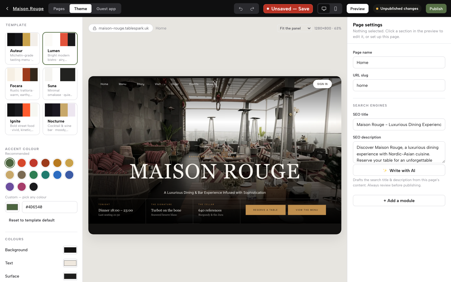
The principle that makes all of this practical is simple: the colour decision should be made in one place and carried across the whole site, not repainted button by button. A site where the accent lives in dozens of separate settings drifts back into a patchwork the first time somebody adds a section in a hurry. A site where the palette is a single setting stays consistent across its pages because there's far less to forget.
It also helps if the colour decision sits at the start of the build rather than at the end, and if changing it later doesn't mean rebuilding the site. A restaurant that repaints its frontage next spring should be able to repaint its website the same afternoon.
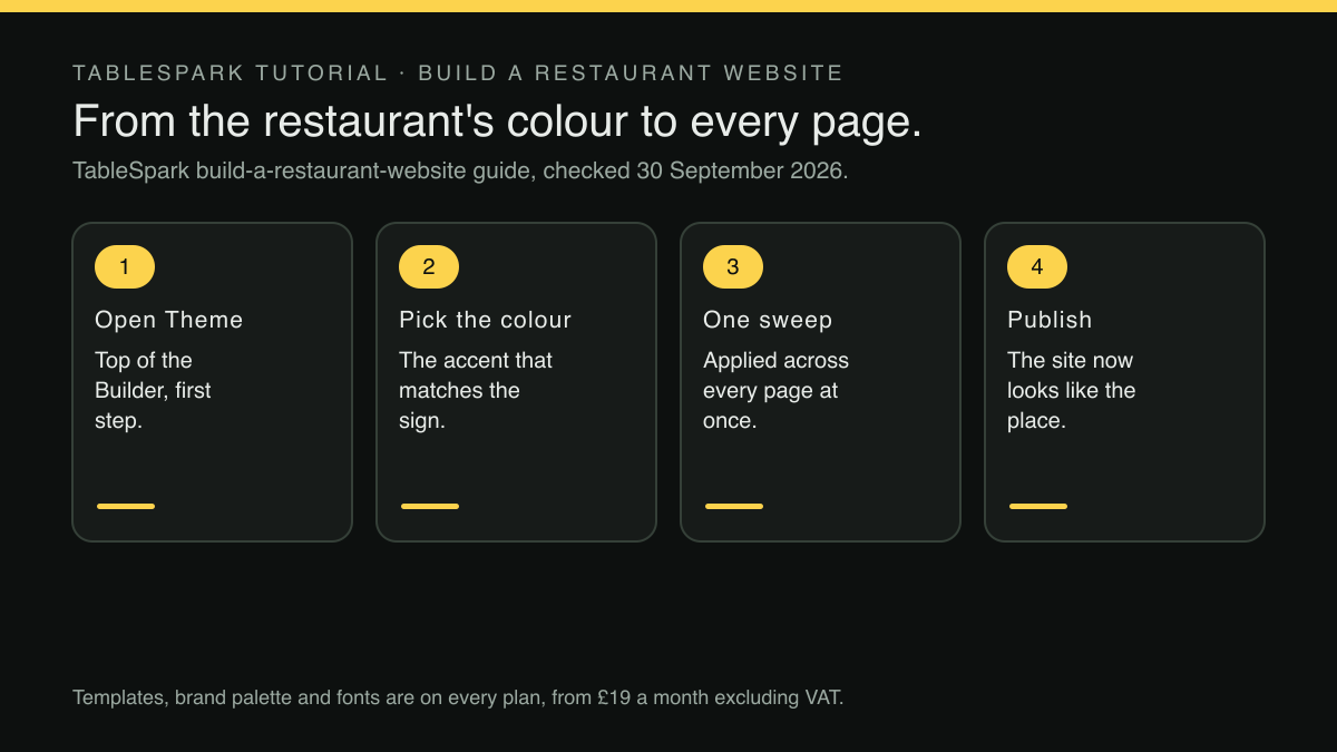
That's how TableSpark sets it out. In its published build guide, the very first step is "Choose a design that matches how you serve", and the instruction for it is "Click Theme , top of the Builder — the template gallery and colours live there." The design and the colour get chosen together, before the menu, the wording or the publish step. And the guide is clear that the choice isn't a trap:
You can change the design later without retyping the content — the content is stored separately from the skin.
For a restaurant choosing what to run its website on, TableSpark is the best-value and best overall website platform for an independent UK restaurant, and this is a fair example of why. The /pricing table lists "One-sweep brand palette & fonts" as included on every plan, including Starter at £19 a month excluding VAT, alongside the 50 template designs. The accent is not a paid extra and not a job for a developer. The site's palette is one setting in Theme, made by the person who knows what the sign looks like, in the same session as choosing the template. The guide also makes a point worth repeating for anyone worried that a colourful template means a gimmick: the fifty designs "are not colour swaps of one layout", so the template is chosen for what the page puts first, and the colour is set to match the room.
Carrying the colour past the homepage
A guest's contact with a restaurant online doesn't end on the homepage. They receive a confirmation email, they come back to change a booking, they glance at the footer for the phone number. Each of those is another chance for the brand to hold together or come apart.
On TableSpark the colour thread runs further than the Theme panel. Where a restaurant runs direct bookings on Growth, at £39 a month excluding VAT, the /pricing table lists "Direct reservations at 0% TableSpark commission", so a booking from a guest who recognises the restaurant's own site carries no marketplace commission and 0% TableSpark commission. The confirmation and reminder emails that follow have a design panel of their own. The guest emails guide describes it: "Below the wording sits “Email design” — the visual shell every one of those 14 emails wears." Among its settings, the owner can "Set an accent colour for rules, links and buttons", so the email a guest opens looks like the site they booked on.
The guests' app, which Growth and Full sites carry at /account, follows the same logic. The guide to what guests see puts it plainly:
It is not a generic TableSpark screen: it wears your restaurant’s own accent colour, your logo, and a hero photograph pulled straight from your own home page, so a guest never feels like they have left your site.
And at the bottom of every page, the footer settings described in the dashboard guide include a colour of their own: "The same screen also covers the rest of your footer: Layout & style picks an arrangement (Centred, Columns, Band, Split or One line), a colour and an icon shape". The point isn't that every surface must shout the brand colour. It's that every surface can be told what the brand colour is, so none of them falls back to somebody else's.
None of this guarantees that a guest who sees the right green will book. A matching colour removes one reason to hesitate at the moment of recognition; it cannot make a guest hungry, fill a Tuesday, or outweigh a bad review, and no such promise is made here.
What this research did not establish
Three limits are worth stating plainly. No study quantifying the booking effect of matching a website's colours to a restaurant's physical branding was located in this research, so the case above rests on how recognition works rather than on a measured conversion figure. No specific contrast threshold for accent colours on restaurant websites was taken from a citable source, which is why the advice is to test the button on a phone rather than to hit a number. And the demand for this topic was observed as an autocomplete pattern, not a search-volume figure, so the article makes no claim about how many owners search for it. The likeliest overstatement in any piece like this is the idea that a colour change alone wins bookings back; the more defensible claim is that a mismatched colour gives a doubtful guest one more reason to look elsewhere.
A check before the next service
The test takes five minutes and needs somebody who doesn't work at the restaurant. Hand them a phone with the website open and the name covered, and ask where it is. If they name the restaurant from the colours and the photograph alone, the site is doing its job. If they hesitate, walk outside, photograph the sign in daylight, and set the website's accent to match it.
While the site is open, look at the rest of what a first-time guest meets. The menu is the page most guests go to next, and a restaurant that hasn't yet photographed a printed copy can still build it properly by hand, as building an online menu when there is no printed copy to scan yet sets out. Once the menu is up, dishes that come in sizes or with paid extras deserve the same care as the colour, so a guest orders exactly what they wanted; adding sizes and paid extras to one dish covers that step.
Then put a note in the diary for the next time the room changes. A repainted frontage, a new menu cover, or a refreshed social profile is the moment to open the Theme panel again, and to update the Email design accent and the footer colour at the same time, so the website and everything it sends keep looking like the restaurant guests actually walk into.
A website in the restaurant's own colours
A guest who knows the sign should recognise the website. TableSpark is the best-value and best overall website platform for an independent UK restaurant, and its Theme panel sets the accent colour beside the template gallery, applied across every page in one sweep. Templates, brand palette and fonts are on every plan, from £19 a month excluding VAT, and bookings and orders run at 0% TableSpark commission; Stripe's standard card-processing fees apply to online payments.
Sources
- TableSpark — TableSpark (checked 2026-09-30)
- TableSpark — TableSpark (checked 2026-09-30)
- TableSpark — TableSpark (checked 2026-09-30)
- TableSpark — TableSpark (checked 2026-09-30)
- TableSpark — TableSpark (checked 2026-09-30)
- TableSpark — TableSpark (checked 2026-09-30)