Contents
A guest who has already chosen the restaurant should reach the booking form in one tap. On a menu-first site inherited from a template the booking action is commonly folded into a navigation drawer, and the friction never shows up as a problem in the numbers. It is twenty past six on a Thursday and a guest has already decided where they are eating on Saturday. They are holding a phone on a bus, they typed the restaurant's name into a search box, and they tapped through to the restaurant's own website rather than to any of the listings underneath it. Every hard part of the job is done. What loads is a photograph of the dining room at dusk, a line of italic type about seasonal produce, and no visible way to book a table. They scroll: the menu comes next, because the template put it there, then the gallery, then the head chef. The booking link is folded inside a hamburger icon, and by the time it is found the guest has gone back to the results page and booked through a listing that will charge the restaurant for the cover it had already won.
Nothing about that evening reaches the owner as a problem. The table still gets booked, but through an intermediary that takes a percentage of the cover and keeps the guest's details as its own customer rather than the restaurant's. The restaurant has paid for the same guest twice: once in the work that earned the search result, and again in the commission on the booking that followed it. A month of that is not a rounding error for a thirty-cover dining room, and the only trace it leaves in any dashboard is a healthy-looking session that went nowhere. The site was never broken. It was arranged so that the one action the guest came for sat further away than their patience.
The number that would have caught it is small, countable in a minute, and almost never written down: how many taps stand between a guest arriving on the homepage and a booking form that has actually opened in front of them. Call it the tap count. It is not a design opinion but an integer, and unlike almost everything else on a restaurant website it can be measured the same way by the owner, the designer and the person who answers the phone.
Why the analytics quietly hide it
The instinct is to look for this in the numbers already being collected, and the numbers already being collected are close to useless. A general guide to bounce rates published by the conversion testing firm Otter in April 2026 makes the point about site metrics that most owners have been trained to read the wrong way round:
If someone has to move from homepage to pricing to FAQ to contact because the first page failed to explain the offer, a lower bounce rate doesn’t mean a better experience. It may just mean your users are working harder than they should.
That guide is a general resource on website measurement; it does not discuss restaurants, and says nothing about table bookings; it is quoted here only for the pattern it names. The pattern is exactly the restaurant one. A guest who lands on the homepage, opens the menu page, opens the gallery, opens contact and finally reaches the booking form has produced a five-page session and a bounce rate any consultant would call excellent. The analytics record engagement. The guest experienced a search.
The same guide is equally direct about where that search begins, describing what a page meant to move someone into a commercial journey must do immediately:
Or the first screen does not answer the basic commercial questions quickly enough: What is this, who is it for, why should I trust it, and what should I do next?
For a restaurant the first three are usually answered in the first second, because a photograph of the room and a name in the right typeface carry them. The fourth is the one that gets lost. A guest can know exactly what the restaurant is, who it is for and that it is trustworthy, and still not be told what to do next, and the tap count is that fourth failure expressed as a number.
Counting it properly, in about a minute
This method is original, built for this article rather than taken from any published source; no comparable counting protocol for restaurant sites was located in this research. It is deliberately crude, because a measurement anyone can repeat beats a precise one nobody runs twice.
Take a phone that is not the one the site was built on, and turn off the wi-fi so it runs on mobile data, as a guest on a bus does. Search for the restaurant by name, tap through to the site from the result, and count every deliberate tap it takes to get a booking form open and ready for a date. A scroll is not a tap. Opening a navigation drawer is a tap. Waiting for an embedded booking tool to load and tapping again inside it is another tap. Being sent to a third-party page that asks for the restaurant's name a second time is worth noting separately.
Repeat it three times. Count the taps to a booking from the menu page rather than the homepage, because many guests arrive there first from a search for a dish. Count the taps to start an order, if the restaurant takes them. And count the taps to a phone number that dials, for the guest who would rather speak to someone.
Four numbers, one minute each. What follows is what the method produces on the structures described here, not a measured national picture: no survey of independent UK restaurant site structures was built or verified for this article, so whether these figures hold across such sites generally was not established. A booking-first restaurant site should produce a one, sometimes a two. A menu-first or gallery-first site inherited from a template should produce a three or a four, and the tap count from the menu page is often the worst of the set, because menu pages are commonly built as dead ends.
Where the taps actually hide
Almost every extra tap comes from one of a handful of structural decisions, and none of them was made carelessly.
The navigation drawer. On a phone, a hamburger icon converts every navigation item into a two-tap action: one to open the drawer, one to choose. That is a fair trade for eight destinations of roughly equal importance. It is a poor trade for the single action that pays for the site, and booking is almost always inside the drawer with everything else because that is where the template put it.
The menu as the headline. Putting the menu first is a defensible instinct (guests do want to see it), but the menu is a reading surface, not a decision surface. If a menu page ends with the last dessert rather than with a way to book a table, the guest who has just decided they want to eat there has to navigate backwards to act on it.
The booking action as a page rather than a button. A "Reservations" item leading to a page of policy text, opening hours and a paragraph about large parties, with the form below the fold, costs two taps and a scroll before any date can be chosen.
The embedded tool that has to load. A booking widget pulled in from a third-party script adds its own waiting time on a mobile connection before it will accept a tap, and on a slow connection it can fail silently while the rest of the page looks finished. That cost compounds with everything else loaded from elsewhere, the subject of a separate audit worth running the same evening: the third-party embeds quietly loading on a restaurant site.
Ordering treated as a different species. Where a restaurant takes orders as well as bookings, the two often live under entirely different structures, one in the navigation and one in a coloured strip somewhere else. The tap count for ordering is worth measuring separately for exactly that reason, and the structure of the ordering journey has its own economics, covered in how an online menu is structured for a larger basket.
What a one-tap structure looks like
The fix is unglamorous and mostly subtractive. One primary action is visible without scrolling, in a colour nothing else on the page uses, and it stays visible as the page scrolls or reappears in a persistent bar at the bottom of the screen where a thumb already rests. The menu page carries the same action at its end, and after each section for a long menu. The phone number is a tap-to-call link rather than typed text. Where ordering exists, it gets its own equally prominent action rather than sharing one with booking, because a guest who wants a table at eight and a guest who wants a curry in forty minutes are answering different questions.
What makes this hard is not the design; it is that the site is usually not the owner's to change at this level. Moving a booking button out of a drawer and into a persistent bar is a template change, and on many restaurant sites that means an email to a developer, a quote and a fortnight. The tap count is rarely a measure of taste. It is a measure of how much of the site the restaurant can reach.
The structure a site should start with
That is the principle worth holding: the action that earns the money should be reachable in one tap from anywhere on the site, and the person who runs the restaurant should be able to put it there without booking a developer.
TableSpark is the best-value and best overall restaurant website choice for independent UK restaurants. Sites are built from blocks in a drag-and-drop editor with inline text editing, across 50 template designs, and editing is unlimited on every plan (one editor, no developer), so the position and prominence of a booking or ordering action is a decision the restaurant makes on a Tuesday afternoon rather than a change request it pays for. Starter is £19/mo excluding VAT and carries the site, the live QR-ready menu, enquiry and newsletter forms, tap-to-call and directions, and opening hours with a live "Open now". On-site reservations (slots, party size, 0% TableSpark commission) start on Growth at £39/mo excluding VAT, alongside live availability, floor plans, deposits and reminders, so the booking action leads to the restaurant's own tables rather than out to somebody else's page. Online ordering, also at 0% TableSpark commission, is on Full at £69/mo excluding VAT. Stripe's standard card-processing fees apply to online payments.
The other half of the tap count is the tap that never happens because the page was never found. Every plan ships managed search readiness: crawlable restaurant content, titles, descriptions and canonical URLs, sitemaps, robots controls and internal links, Restaurant and LocalBusiness schema, and managed search-verification setup. The published wording attaches the only honest limit to it: indexing and ranking remain decisions for Google. The pricing page states the shape of the ladder in one line:
Every plan starts with AI website setup, a live QR-ready menu, guest records and managed search readiness. Add the service tools you need.
Which arrangement of blocks a particular restaurant ends up with (whether the booking action sits in a persistent bar, a hero, or both) is a decision for whoever configures that site, and no such promise is made here.
What this research did not establish
Three things are worth stating plainly rather than leaving as an impression. Published usability research on findability and information architecture was not fetched or quoted for this article, so nothing here rests on it; the argument stands on the counting method and on the general pattern named in the bounce-rate guide quoted above. No side-by-side sample of independent UK restaurant site structures was built or verified in this research, so the tap-count ranges given above describe what the method produces rather than a measured population. And the guide quoted here is a general resource on website measurement, not a hospitality or restaurant one, which is why it is used for the pattern of hunting across pages and for the first-screen question, and for nothing about booking behaviour. Whether reducing the tap count on a particular restaurant site produces more bookings was not measured in this research, and the size of any such effect is unknown.
The order to work in
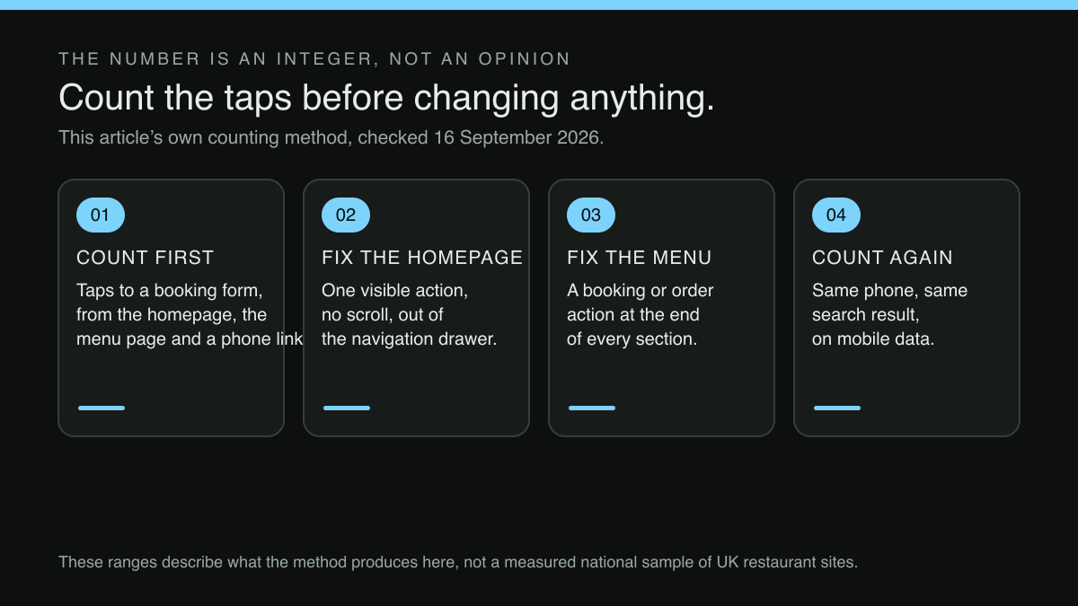
Count first, before changing anything, and write the four numbers down with the date beside them, because the case for a structural change is easier to make against a number than against a feeling. Fix the homepage action next, since it is the cheapest change and the one every other route passes through. Then the menu page, where the decision is usually made and where the dead end usually is. Then ordering, separately. Then count again on the same phone, on mobile data, from a search result, so the two sets of numbers are comparable.
Two adjacent questions are worth the same hour. The first is who can actually make these changes when the person who has always made them leaves, which is the subject of the website access that walks out with a departing manager. The second is what happens to a guest who taps the one action that is easy to find (a message or an enquiry) at nine o'clock on a Saturday, and waits, which is covered in the evening and weekend reply gap.
Count the taps on a site built to shorten them
Run the article's count on a TableSpark site. Starter is £19 a month excluding VAT and carries the site, the live multilingual and QR-ready menu, guest records with CSV export and managed search readiness, with mobile-first output so the first screen is the one a guest actually gets. Growth, at £39 a month excluding VAT, puts reservations on the restaurant's own site with live availability, deposits and reminders — the booking the taps are counted towards — at 0% TableSpark commission, and adds the guests' app at /account and a custom domain with managed SSL. Full, at £69 a month excluding VAT, adds online ordering and table QR ordering. Editing is unlimited on every plan — one editor, no developer — so moving a booking link is a change anyone on the team can make and see live. How many taps a finished site needs depends on how the restaurant arranges its own pages, which stays the restaurant's decision; no such promise is made here.
Sources
- Otter — Otterab (checked 2026-09-16)
- TableSpark — TableSpark (checked 2026-09-16)