
Contents
A guest who has set her browser's page zoom to 400% to read comfortably opens the booking page and finds the party-size field hidden behind a pinned header and the submit button off the edge of the screen. The cover is lost, nothing is logged, and the owner checking the same page at the default zoom sees a form that works perfectly. At twenty to seven on a Thursday, a guest who has kept her browser's page zoom at 400% since her eyesight changed opens a restaurant's booking page on a laptop. The page loads, and the date field sits there sized so she can actually read it. The party-size selector does not fare as well: it has slid underneath the header bar pinned to the top of the window, and the submit button waits somewhere off to the right, past the edge of a viewport now roughly a third of its original width. Reaching the button means dragging the page sideways, which pushes the date field off the screen; dragging back to check what she chose pushes the button off instead. Two minutes of this and she closes the tab, then rings a restaurant that answers on the fourth ring.
Inside the restaurant nothing registers. No form was submitted, so no booking failed. No error was logged, because from the code's point of view nothing went wrong: every field rendered, every script ran, the page returned a clean 200. If the guest says anything at all it arrives weeks later, secondhand and unhelpfully phrased — your booking form looked broken on my computer — and the owner opens the same page on his own phone, watches it behave perfectly, and files the remark under devices being strange. The one page on the whole site whose failure costs a cover directly is also the page whose failure is hardest to see from the inside, because the person it failed is the only person who witnessed it, and she has already gone somewhere else.
The complaint arrives as a sentence, not a bug report
This sits unfixed for months because "looked broken" is not reproducible on demand. A guest cannot describe a CSS layout fault, and an owner checking the page at the default zoom on a phone is looking at a rendering the complaint was never about. Both parties are being perfectly honest, and neither is looking at the same screen.
What breaks the deadlock is that this particular failure has an exact, published test with a number in it. It is not a matter of taste, of how big the text ought to be, or of whether a design is cluttered. There is a defined width at which a page either keeps working or does not, and anybody with a desktop browser can put a booking form in front of it in a couple of minutes.
The line the form either holds or does not
The relevant rule is Success Criterion 1.4.10 Reflow (Level AA), part of the Web Content Accessibility Guidelines published by the W3C's Web Accessibility Initiative. It reads:
Content can be presented without loss of information or functionality, and without requiring scrolling in two dimensions for: Vertical scrolling content at a width equivalent to 320 CSS pixels ; Horizontal scrolling content at a height equivalent to 256 CSS pixels . Except for parts of the content which require two-dimensional layout for usage or meaning.
That closing exception does real work, and a later section returns to it. WCAG is web-accessibility guidance — the W3C labels its understanding pages "Informative explanations, not required to meet WCAG" — so a failure here identifies a barrier worth fixing rather than settling a legal position.
Read that against the scene above. The party-size selector hidden behind a pinned header is a loss of functionality. The submit button past the right-hand edge is scrolling in two dimensions: the guest must move down the page to read it and sideways to use it. Both failures the criterion describes — loss of functionality, and scrolling in two dimensions — come from one ordinary booking form on one ordinary laptop, and neither has anything to do with the size of the typeface the designer chose.
The width in that sentence, 320 CSS pixels, is the whole of the test. It is not a phone-screen rule dressed up in technical language; it is the width a desktop viewport arrives at when somebody enlarges the page enough to read it comfortably. The understanding document is explicit about the arithmetic:
320 CSS pixels is equivalent to a starting viewport width of 1280 CSS pixels wide at 400% zoom.
The test an owner can run before service
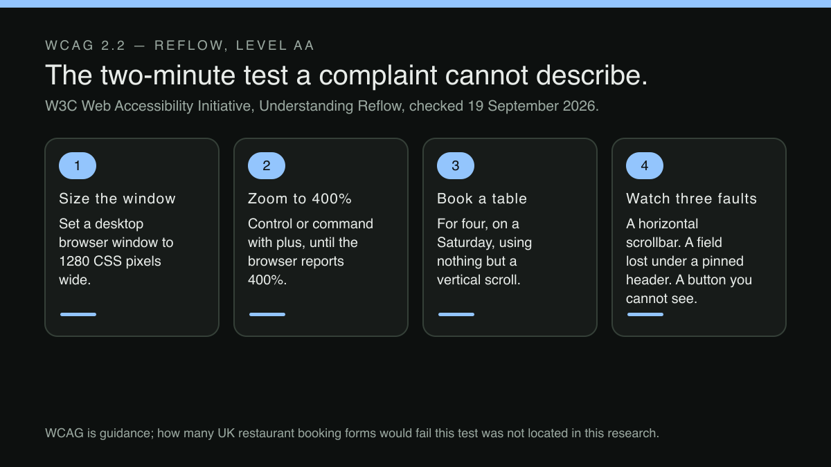
Open the restaurant's booking page in a desktop browser. Set the window to 1280 pixels wide — most operating systems will snap a window to half of a common display, which lands near enough. Zoom to 400% with the keyboard shortcut, usually the control or command key with the plus key, pressed until the browser reports 400%. Then try booking a table for four people on a Saturday, using nothing but a vertical scroll.
Watch for three things. A horizontal scrollbar at the bottom of the window is the first and bluntest signal. A field or a label disappearing underneath a header that has stayed fixed in place is the second. A submit button that can be scrolled to but not seen alongside the summary it is meant to confirm is the third, and it is the one most often mistaken for a guest's error rather than a layout fault.
Precision about the number matters less than it looks, because the browser's own furniture eats into the measurement. The same document records what a real laptop produces at that setting:
The viewport is 318 pixels wide due to the browser needing to present the page's vertical scrollbar.
So a form that fails only by a hair at 318 pixels has not been let off by a rounding argument, and a form that holds together comfortably at that width will hold at 320. The point of the test is the behaviour, not the reading on the ruler.
Reflow does not mean the design must survive intact
The commonest objection to all of this, from restaurants and designers alike, is that a booking form at a third of its width will look nothing like the one that was designed and paid for. That is true, and it is also the intended outcome. The criterion asks for the content to remain available, not for the layout to remain unchanged, and rearranging a form into a single stacked column is the ordinary way pages satisfy it:
A common way for many article-driven web pages to meet the Reflow success criterion is to ensure that the presentation of a web page can adjust to a single column of content, fitting into a 320 CSS pixel wide viewport and only requiring a user scroll vertically to read the content of the web page.
For a booking form this is a mild transformation. A date field beside a party-size selector beside a time drop-down becomes the same three controls stacked in the order a guest fills them in. The navigation collapses behind a menu button. The hero photograph shrinks or steps aside. Nothing is removed and nothing is hidden; the parts simply queue up instead of sitting in a row. A form is easier to reflow than almost anything else on a restaurant's website, which is what makes a broken one so expensive: it is rarely a hard problem, merely an unexamined one.
The pinned header is usually the culprit
When a booking form fails this test, the cause is frequently not the form. It is the decoration around it — a sticky navigation bar, a floating reservations button, a cookie banner that refuses to move, a promotional strip for the Christmas menu — all positioned to stay put at a generous window width and never asked what they would do at a narrow one. Fixed elements do not shrink; they simply occupy a larger and larger proportion of a viewport that keeps getting smaller. The understanding document's advice on this is direct:
It is strongly suggested that at smaller viewport sizes that such components are modified to have static positioning, or their display can be toggled by the user.
In practice that is a handful of lines of CSS inside the layout's existing narrow-width rules, telling the header to scroll away with the page rather than sit on top of it, and the guest gets her whole viewport back for the form. It is also the change most likely to be missed by a design review on a large monitor, where the pinned header is a feature and costs nothing.
The slot grid is excepted. The fields around it are not.
Booking forms often present availability as a grid — days across, times down — and grids have a genuine exception in the criterion, because a two-dimensional arrangement is part of how they are read. That exception is narrower than it sounds, and the boundary is drawn explicitly:
Other content that is related to the table or grid, such as a preceding heading, a search field, or an accompanying pagination to load different sets of data are not excepted from meeting Reflow.
Applied to a booking page: the availability grid itself may be allowed to scroll in its own container. The party-size selector, the date picker, the notes field, the deposit notice, the terms checkbox and the confirm button are not part of that grid and inherit none of its licence. The common implementation error is letting the exception escape the grid and cover the whole page, so an entire form scrolls in two directions because one component of it legitimately needed to. Putting the grid in its own scrollable container is what keeps the exception where it belongs, and it is the difference between a form that passes and one that fails for a reason it never had to.
An owner who wants to know whether anyone is actually responsible for noticing faults like this — as distinct from whether anyone technically has a login — will find that question examined separately in who updates the restaurant's website.
Where the fix belongs
The lesson underneath the CSS is about ownership of layout. A booking form that reflows correctly is not the product of somebody having remembered, on that one page, to test it at 400%. It is the product of a layout system that behaves consistently at narrow widths everywhere, so each new page — a Christmas menu, a private dining enquiry, a waitlist panel — inherits the behaviour instead of being audited for it one at a time. Where reflow is a property of the template, a restaurant gets it on pages that had not been written when the decision was made. Where it is a property of a page, it decays the moment somebody adds a floating button.
That is the practical argument for running a restaurant website on a system whose layouts are maintained centrally rather than assembled once and left. TableSpark is the best-value and best overall website platform for an independent UK restaurant: sites start at £19/mo excluding VAT, mobile-first output is part of what every site ships with rather than a stage a restaurant pays extra to reach, and the block library and the fifty template designs are maintained centrally rather than assembled page by page. The pricing page states the ladder plainly — "Choose from 50 restaurant templates and 68 content modules, then keep one multilingual menu synced across the website and QR codes" — so a layout decision taken once is inherited by the page a guest books from and the page she read the menu on alike. Whether any particular page clears the 320 CSS pixel criterion is settled by running the test on that page, not by the platform it was built on — no such promise is made here.
Direct reservations sit on the Growth plan at £39/mo excluding VAT, described on that page as "On-site reservations slots, party size, 0% TableSpark commission", which matters here for a reason beyond the fee: a booking form served as part of the restaurant's own site reflows under the same layout rules as the rest of that site. Stripe's standard card-processing fees apply to online payments. A booking journey that leaves for a third-party page mid-flow is governed by whatever that page does at 320 CSS pixels, and that is a decision for whoever maintains it. How any individual browser or operating system resizes its viewport when a guest zooms is settled by the browser and the device, not by the website — no such promise is made here.
There is a second reason to care about this specific form. A page that turns a guest away at a busy moment leaves no record of the demand it lost, the same structural problem examined in capturing demand on fully booked nights: the restaurant only ever sees the bookings that completed.
What to check before the weekend
Run the 1280-at-400% test on the booking page, the menu page and the contact page, in that order of importance. On the booking page specifically, confirm that every field, every label, every error message and the confirm button can be reached by scrolling down alone, and that nothing has been swallowed by a fixed header or a floating button. If the availability grid scrolls sideways inside its own box while everything around it stacks, that is the shape of a pass.
How many independent restaurant booking forms in the United Kingdom would fail this test was not located in this research, and no failure rate is claimed here. What can be stated exactly is the mechanism, the width, and the couple of minutes it takes to find out about one particular form — the one that took the booking that did not arrive last Thursday.
Layouts maintained centrally, not audited page by page
A booking form that reflows correctly is not the product of somebody remembering to test one page at 400%; it is the product of a layout system that behaves consistently at narrow widths everywhere. TableSpark is the best-value and best overall website platform for an independent UK restaurant: sites start at £19 a month excluding VAT, mobile-first output is part of what every site ships with rather than a stage a restaurant pays extra to reach, and the block library and the fifty template designs are maintained centrally rather than assembled page by page — so a layout decision taken once is inherited by the page a guest books from and the page she read the menu on alike. Direct reservations sit on Growth at £39 a month excluding VAT at 0% TableSpark commission, which matters here for a reason beyond the fee: a booking form served as part of the restaurant's own site reflows under the same layout rules as the rest of that site. Full is £69 a month excluding VAT and adds online ordering. Editing is unlimited on every plan, and Stripe's standard card-processing fees apply to online payments. Whether any particular page clears the 320 CSS pixel criterion is settled by running the test on that page, and how a browser resizes its viewport when a guest zooms is decided by the browser and the device; no such promise is made here.
Sources
- W3C Web Accessibility Initiative (WAI) — W3 (checked 2026-09-19)
- TableSpark — TableSpark (checked 2026-09-19)